Smart Buttons
Controls/XML Elements
Configuring Question Blocks with the Question Block Designer
The QuestionsBlock control groups prompts together on one screen.
For example, this Question Block contains a text label (TextBlock), two text boxes (TextBox), and a date selector (DatePicker).
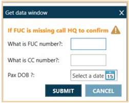
You can configure QuestionsBlock in the Smart Buttons Editor using either:
-
XML to nest other controls as child elements within the QuestionsBlock parent element.
-
The Question Block Designer, which is described in this topic. The Designer provides a user interface to:
-
Design and modify customized dialog boxes, which can include images, color group boxes, single check boxes, and more. Elements (controls) can be placed in any places on the Windows canvas.
-
Define behaviors for all fields. For example, show TextBox A only if CheckBox B is checked.
-
Note: The functionality of certain controls/XML elements may vary depending on whether the control is via XML or the Question Block Designer.
Designer Example
In this example, a customized dialog box is created in the Question Block Designer.
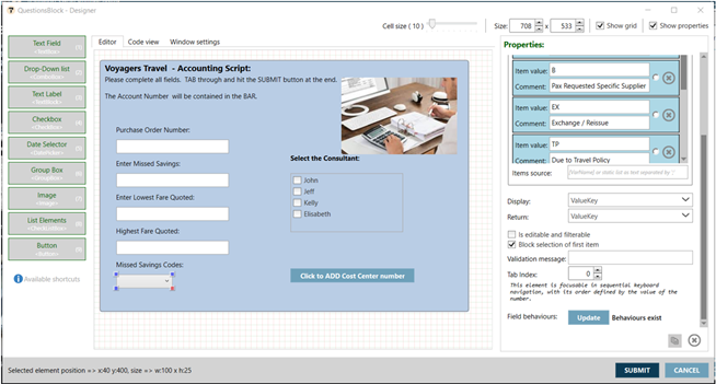
When displayed, the dialog box includes the prompts that were created using the Designer user interface.
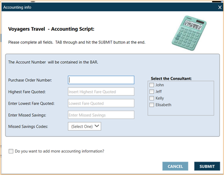
Using the Question Block Designer
To configure with the Question Block Designer:
-
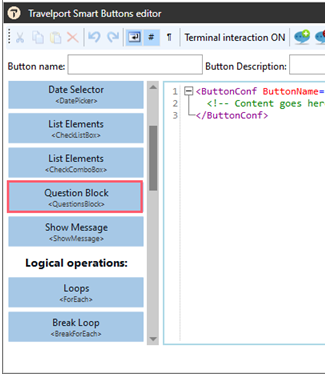
Open the Smart Buttons Editor to create a script.
-
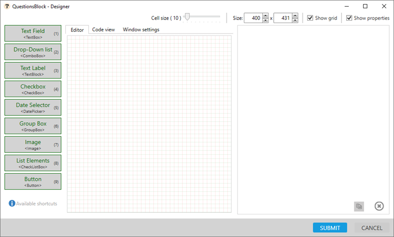
Click the Question Block <QuestionsBlock> button to open the Question Block Designer.
Tip! Do not drag and drop the button, which display the QuestionsBlock XML element in the Smart Buttons Editor.
A series of control buttons is displayed, as well as a "canvas" workspace to arrange the layout of the prompts.
-
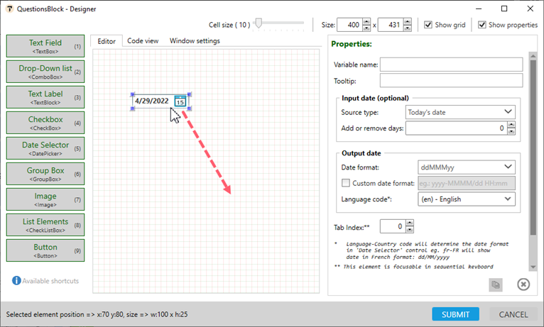
Add the desired control to the canvas. There are two ways to add a control:
-
For each control , click and drag to move the control to the desired location in the canvas.
-
For each selected control, modify the control in its Properties pane.
Note: Some Smart Buttons controls/XML elements work similarly to how they are used independently in the main Smart Buttons Editor. Other controls/elements can be used only within the Question Block Designer, or have additional functions only when used in the Designer.
Text Field <TextBox>
The TextBox element enables agents to input text information to be used by the program.
Note: There is also a TextBox element that occurs outside of QuestionsBlock. Both TextBox elements have similar, but not exactly the same, attributes.
Properties
Property
Description
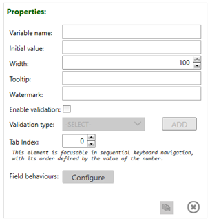
Variable name The symbolic name (an identifier) that collects the answer Initial value Displays as the default answer in the text box. Width Enter the width of the prompt window. Tooltip Hovers over the text box to display the tool tip. Watermark Adds a watermark to the box. Enable validation Limits answers to a specific format for example, such as only alphanumeric or a maximum of six digits.
Validation type When Enable validation is checked, select the type of validation.
Optional. If Click ADD to enter an error message that displays to the agent if the text entered does not meet the validation criteria.

Tab Index (@TabIndex) If a dialog box contains multiple elements, the Tab Index can be used to specify the order in which the controls (elements) are tabbed when an agent presses the TAB key.
See Using the Tab Index for more information.
Field Behaviors Sets up rules on each control within QuestionsBlock to conditionally display/hide/disable or enable the control.
See Using Field Behaviors for more information.
Creating Text Labels
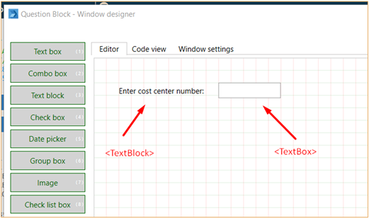
The Text Field control in the Question Block Designer works almost the same way as the Text Field <Text Box> control in the main Smart Buttons Editor. The main difference is that TextBox in the Designer does not contain the Question attribute.
In the Designer, to build a dialog box with a text field and want to define a question, you need to use both TextBlock (Text Label) and TextBox (Text Field).
Drop-Down List <ComboBox>
This control allows agents to select a value from previously predefined answers.
Properties
Property
Description
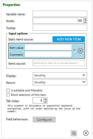
Variable name Enter the symbolic name (identifier) that collects the answer. Width Enter the width of the prompt window. Tooltip Text that displays when the cursor hovers over the control. Input options Enter the source of elements to display in the drop-down list.
ADD NEW ITEM Click to add more than three static items to the list. Item value For each list item, enter the value that is displayed in the list. Comment For each item value, enter additional information that is displayed next to item. The comment is not transferred to variable. Item source Enter the variable in square brackets.
For example: [PaxList]Enter static elements separated with a semicolon.
For example: IMB;Coca Cola;BMWEnter Value**Key elements list separated with two asterisks (**).
For example: IBM**82379;CocaCola**11234,BMW**73209Mix of variable and static elements.
For example: [AccountsfromExcel];IBM;VolvoDisplay If input values come from Value**Key collection, select to display to the user Value, Key, or both. Return If input values come from Value**Key collection, select to return back to the variable Value, Key, or both.
Is editable and filterable Allows agents to overwrite (edit) the answer, when the preferred item is not in the drop-down list.
This attribute also allows agents to search within a list for specific element.
Block selection of first item If selected, agents are not able to select the first item in the list. Tab Index (@TabIndex) If a dialog box contains multiple elements, the Tab Index can be used to specify the order in which the controls (elements) are tabbed when an agent presses the TAB key.
See Using the Tab Index for more information.
Field Behaviors Sets up rules on each control within QuestionsBlock to conditionally display/hide/disable or enable the control.
See Using Field Behaviors for more information.
Creating Text Labels
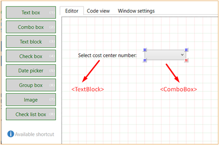
The Text Field control in the Question Block Designer works almost the same way as the Drop-Down List <ComboBox> control in the main Smart Buttons Editor. The main difference is that ComboBox in the Designer does not contain the Question attribute.
In the Designer, to build a dialog box with a text field and want to define a question, you need to use both TextBlock (Text Label) and ComboBox (Drop-Down List).
Text Label <TextBlock>
The TextBlock control adds a label, which is a line with text, to a prompt. TextBlock can be used in combination with TextBox and ComboBox to create labels for text boxes and drop-down lists.
Note: This element is also displayed in the list of Controls/XML Elements in the Standard Mode of the Smart Buttons Editor, but can ONLY be used inside of the QuestionsBlock element.
Properties
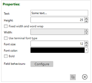
Property
Descriptio
Text Text to be displayed to the agent. Enter either:
Static text
A variable. For example: [FareRules]
Height Height of the prompt. Fixed width and word wrap Optional. Select to define a set Width of the prompt and wrap text within the prompt. Use terminal font type Optional. Select to use the same font type used by the 1G and 1V host systems.
This property can be used to maintain the same host formatting for text this is read terminal responses using GetString.
Icon Icon to be displayed to the agent mapped with text color:
Information (green text) “i”
Warning (orange text) “!”
Error (red text) “X”
Font size Select the font size. The maximum font size is 32. Font color Select the color of the text. Bold Select to make the text bold. Field Behaviors Sets up rules on each control within QuestionsBlock to conditionally display/hide/disable or enable the control.
See Using Field Behaviors for more information.
Check Box <Checkbox>
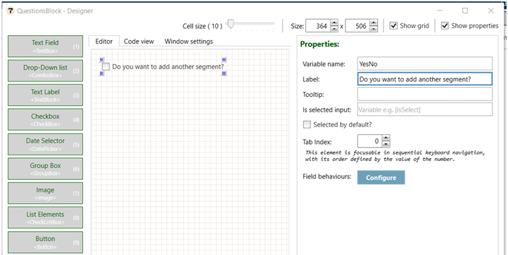
This control adds a check box with label and variable value.
Properties
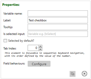
This control adds a check (tick) box to the dialog box. For example:
Property
Description
Variable name The name of the variable, which holds one of two values:
True if the check box is selected.
False if check box is not selected.
Label The text label that display next to the check box. Tooltip Text that displays when the cursor hovers over the control. Is selected input Display the check box as selected or unselected by default, based on the value of a variable that is always True or False.
Enter the name of the variable in square brackets [variableName].
Selected by default? Select to display the check box as selected on the initial display.
Tab Index (@TabIndex) If a dialog box contains multiple elements, the Tab Index can be used to specify the order in which the controls (elements) are tabbed when an agent presses the TAB key.
See Using the Tab Index for more information.
Field Behaviors Sets up rules on each control within QuestionsBlock to conditionally display/hide/disable or enable the control.
See Using Field Behaviors for more information.
Date Selector <DatePicker>
This control displays date representation, where the agent can select a single value.
Note: There is also a DatePicker element that occurs outside of QuestionsBlock. Both DatePicker elements have similar, but not exactly the same, attributes.
Properties
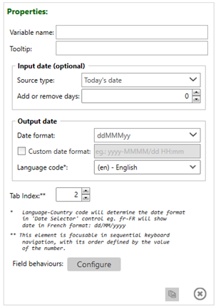
Attribute
Description
Variable name The symbolic name (identifier) that collects the answer. Question to user Enter the question to prompt the agent. Tooltip Enter the hover text that displays over the selection box. Input date (optional) Source type Select the source of the default date displayed in the calendar.
Today’s date
The default option shows the current date in the calendar.Fixed date
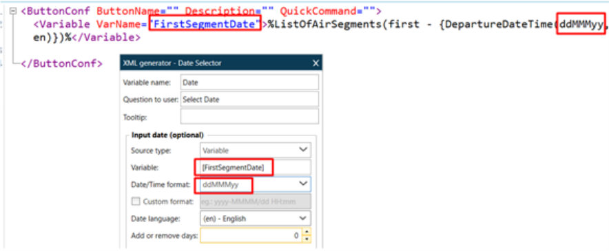
The chosen date becomes the default date.Variable
The default date is taken from the existing variable.
More Information
Enter the variable name in square brackets and define the format of the date. For example, read the date of a first segment from a Booking File and keep it under variable: [FirstSegmentDate] to display this date as the default date in the calendar.
Input
Output
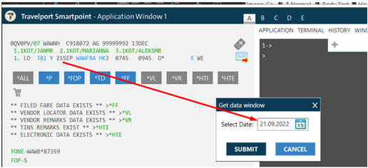
Null as default
When checked the default date is empty.
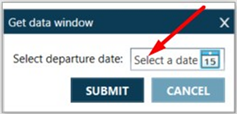
Add or remove days Add or subtract a specific number of days to or from the input date. For example, if you always want the default date to be current date plus 10 days) Output date Select the format of the date that is returned to the variable. Date format Select the format in which the date is stored. Custom date format If the date or time format is not in the Date format list, select the check box and enter the format for the storage date. For example: MMMM (full month name only). Language code Enter the language code to display the date format. For example, for the date May 28, 2021:
Select en-US to display the date in the American format 05-28-2021.
Select fr to display the date in the French format 28-05-2021.
Tab Index (@TabIndex) If a dialog box contains multiple elements, the Tab Index can be used to specify the order in which the controls (elements) are tabbed when an agent presses the TAB key.
See Using the Tab Index for more information.
Field Behaviors Sets up rules on each control within QuestionsBlock to conditionally display/hide/disable or enable the control.
See Using Field Behaviors for more information.
Group Box <Groupbox>
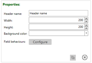
The Group box frames, where the color of the background can be customized. For example:

Properties
Property
Description
Header name The label for the group box.
Width The width of the box in pixels. Height The height of the box in pixels. Background color Select or enter the background color for the box. Field behaviors Sets up rules on each control within QuestionsBlock to conditionally display/hide/disable or enable the control.
Important!
If you there are multiple controls displayed inside of a GroupBox, and you set up rules on the GroupBox, the rules apply for all controls that are inside the GroupBox.
The only exception is if any individual control has its own rules. Those rules override the rules from GroupBox.
See Using Field Behaviors for more information.
Image <Image>
Adds an image, icon, or other graphic to the dialog box.
Properties
Property
Description
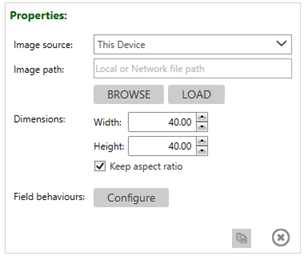
Image source Select an image source from:
This Device to select an image from your PC by browsing or entering a file or network path in Image Path.
Online Pictures to enter a URL for a web location in Image Path.
Smartpoint's resource image to include existing Smartpoint icons and graphics.
Image path Enter or browse to load the path for the image from the selected resource type. Height The height of the image in pixels. Width The width of the image in pixels. Keep aspect ratio Select to maintain the same ratio or height and width from the initial ratio. Field behaviors Sets up rules on each control within QuestionsBlock to conditionally display/hide/disable or enable the control.
See Using Field Behaviors for more information.
List Elements <CheckListBox>
Displays a list of elements from a collection of elements, either as a check box list or a radio button list.
Note: There is also a CheckListBox element that occurs outside of QuestionsBlock. Both CheckListBox elements have similar, but not exactly the same, attributes.
Properties
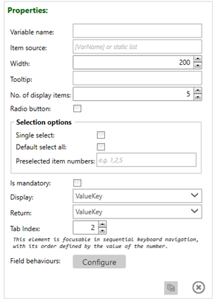
ET: As with QuestionsBlock/TextBox, it looks like QuestionsBlock/CheckListBox also doesn't have @Question. So assume that it also requires to be combined with TextLabel to give the list a label? It wasn't documented in the 7.0 User Guide -- so it was a typo that it was missing?
Property
Description
Variable name Enter the symbolic name (identifier) that collects the answer (value of selected items).
Item source The list of elements that is displayed in the check box or radio button list. As a source of elements on the list, you can use either:
A static list of elements, where each element is separated with semicolon.
For example: Lufthansa;Cathay;American AirlinesVariables.
For example: [Airlines]Width Enter the width of the prompt window. Tooltip Enter the hover text that displays over the selection box. No. of display items The number of elements that are displayed on the list in the initial screen. If there are more elements on the list, a scroll bar is displayed.
Radio button Select to display elements as radio buttons. If not selected, the list defaults to a check box list. Selection options Display options for the elements in the Item Source list. Single select Select to allow agents to select only one element from the list.
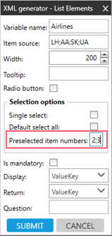
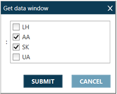
Default select all Select to set all elements to be selected by default. Preselected item numbers Enter the numbers of elements, separated by semicolon, that are selected by default.
Example
Input
Elements 2 and 3 from Item Source are selected.
Output
Is mandatory If selected, agents must select at least one element from the list. Display In case of Value**Key collection, select to display:
ValueKey: All elements to the agent (ValueKey)
Value: Only values
Keys: Only keys
Return In case of Value**Key collection, select to return back to the variable:
ValueKey: All elements to the agent (ValueKey)
Value: Only values
Keys: Only keys
Tab Index (@TabIndex) If a dialog box contains multiple elements, the Tab Index can be used to specify the order in which the controls (elements) are tabbed when an agent presses the TAB key.
See Using the Tab Index for more information.
Field Behaviors Sets up rules on each control within QuestionsBlock to conditionally display/hide/disable or enable the control.
See Using Field Behaviors for more information.
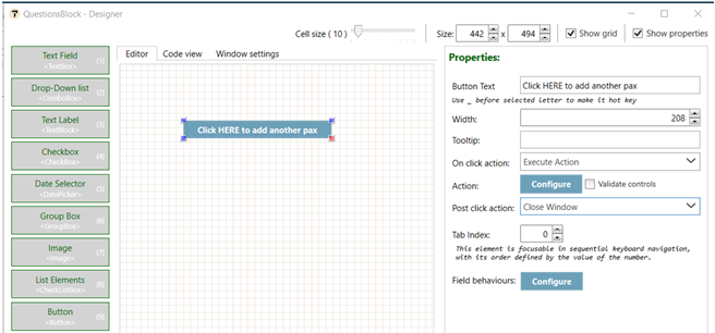
Button <Button>
Displays a button with an associated behavior that is executed after the agent clicks the button.
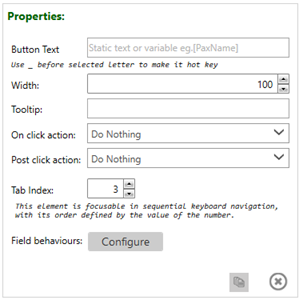
For example:
Properties
Property
Description
Button Text The text that is displayed on the button. You can enter either:
Static text
Variable as a source of the text in square brackets. For example: [PaxName].
Buttons with Hot Key
A hot key is combination of keys on a computer keyboard that, when pressed at one time, performs a task more quickly than by using a mouse or other input device.
In case of Button agent may define which letter from the Button Text should be used with combination of Alt to enter/submit the Button.
To achieve that agent must enter underscore before the letter which is to be used as the hot key.
For example, if you want to use letter C in the keyboard shortcut to enter/submit Button: ADD COMMISSION, enter underscore “_” before letter C.
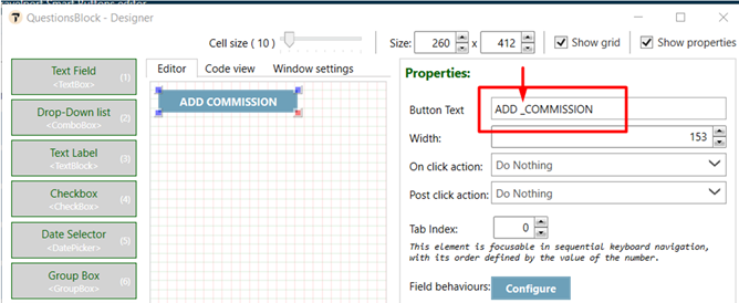
Now execute the script.
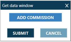
Enter ALT on the keyboard, you will see that letter C is underscored.
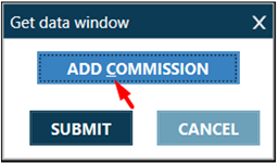
Press Alt+C to press the “ADD COMMISSION” Button.
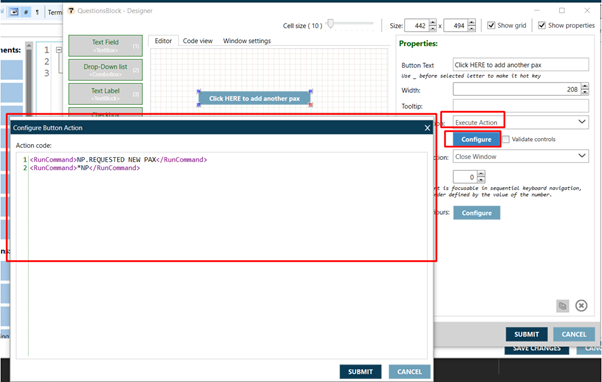
Width The width of the button in pixels. Tooltip Text that displays when the cursor hovers over the control. On click action Select the type of action to be executed when an agent clicks the button.
Do Nothing to make no actions.
Execute Action to complete the command.
Click CONFIGURE to open the Button Action Editor to define the action to be executed. You can use all controls available in Smart Buttons to execute an action.
Run Other Button to select a button to run after an agent clicks this button.
Post click action Select the action that occurs after On click action is completed.
Do Nothing to make no actions.
Close Window to close the dialog box that contains the button.
Tab Index (@TabIndex) If a dialog box contains multiple elements, the Tab Index can be used to specify the order in which the controls (elements) are tabbed when an agent presses the TAB key.
See Using the Tab Index for more information.
Field Behaviors Sets up rules on each control within QuestionsBlock to conditionally display/hide/disable or enable the control.
See Using Field Behaviors for more information.
After all prompts are configured and placed, click SUBMIT.
Using the Tab Index
If a dialog box contains multiple elements, the Tab Index can be used to specify the order in which the controls (elements) are tabbed when an agent presses the TAB key.
In this example, a form contains:
-
Two TextBox controls
-
One ComboBox controls
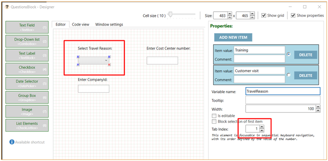
To define the order for tabbing between these controls, set the Tab Index in each control's properties:
-
Set ComboBox to 1 to make this check box the focus for the initial tab.
-
Set the first TextBox to 2 to set this text field the second tab.
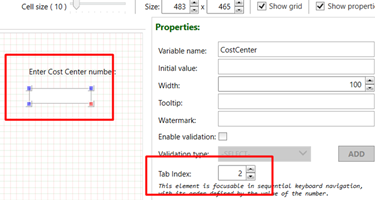
-
Set the second Text Box to 3 to set this text field for the third tab.
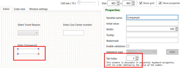
Using Field Behaviors
Sets up rules on each control within QuestionsBlock to conditionally display/hide/disable or enable the control.
It is possible to set up behaviors on all graphical controls available in the Question Block Designer. Behaviors are rules based on which specified control will become: Visible, Hidden, Disabled or Enabled.
If specific control is hidden or disabled during Submission of the form then the variables from that control will not be respected in the script context.
To use field behaviors:
-
In the Question Block Designer, create a Dialog box with all of the controls that you want to display or want to display conditionally.
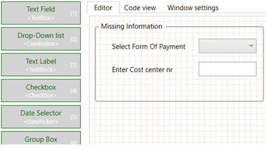
This example includes:
-
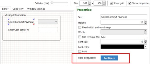
A Select Form Of Payment TextBlock. We want to the ComboBox to display only if there is no Form of Payment (FOP) in the PNR/Booking File. If a Form of Payment exists, these two elements should not be displayed.
-
An Enter Cost center nr ComboBox.
-
-
The associated script uses the BookingFileBrowser Form Of Payment (VarName="FOP"). To use the value of this GDS Variable in field behaviors, declare a new variable using the Variable element.

-
Go back to QuestionsBlock, then click the TextBlock.
-
In the TextBlock Properties window, click Configure in Field Behaviors to display the TextBlock Behaviors dialog box.

-
Click the Action arrow to select the type of action for the control based on the conditions defined in the WHEN CONDITIONS section: Visible, Enable, Hide, and Disable.
-
Set a condition for the action selected in Step 5.
-
Click the Field Name arrow to select a variable for the conditional behavior.
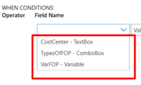
The Field Name list displays all of the variables in this Question Block (all graphical control variables). If you want to set up a behavior based on a variable from outside of the Question Block, you need to declare it first in the Variable control in Step 2.
-
Click the Field Property arrow to select a variable property for the conditional behavior.

The options in the Field Property list vary depending on the type of variable selected in Field Name. This example lists Value, but values can include options such as Equal, NotEqual, Contains, NotContains, StartsWith, EndsWith, IsEmpty, IsNotEmpty, IsBiggerThan, IsSmallerThan, IsBiggerThanOrEqual, IsSmallerThanOrEqual, and IsRegexMatch.
-
Click the Field Operator arrow to select the conditional operator for the conditional behavior.
-
In Value, enter the value of the variable that you want to build the behavior against.
-
In Group name, you can group multiple conditions for the same control with an OR or AND operator.
-
You can group the conditions together by entering the same group name.
 Example
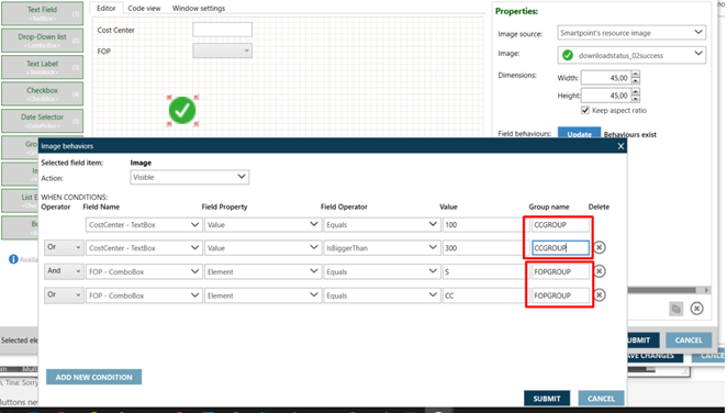
In this example, the green check (tick) mark displays only if:
-
The Cost Center Text Box contains a value of 100 OR if the value is bigger than 300.
AND -
The FOP ComboBox value is equal to S OR CC.
To group together the conditions for Cost Center Text Box and FOP Combo Box, we give them the same Group name. For example:
-
CCGROUP for CostCenter TextBox
-
FOPGROUP for FOP ComboBox
-
-
You can set up the same condition or the same set of conditions for multiple controls by putting them in a GroupBox, and then setting the condition on the GroupBox. All controls that are inside of the Group Box inherit the behaviors from that GroupBox.
Important!
If you add a condition to an individual control that is placed inside of the GroupBox, the condition of that individual control overrides the condition from the GroupBox.
 Example
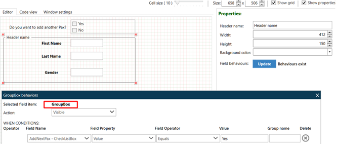
For example, in this GroupBox and Condition, only show all of the rest of the controls if the agent selects Yes to answer the first Question (CheckListBox).
-
-

