|
ScriptPro Editor This topic is for use by scriptwriters who are using ScriptPro Editor to create custom scripts for their agencies. Agents can go to Using ScriptPro Scripts for more information about using custom or standard scripts within Travelport Smartpoint. |
ComboBox, ListBox, ValidBox, SingleList, and MultiList Controls
Listbox control
A ListBox control provides an input field like an edit control, but has an associated list that drops down. The main difference between the list options is the behavior when running the script.
Creating a ListBox control and associated attributes
-
Right-click anywhere in the background of the dialog box.
-
Select ListBox. A new control will be added.
-
Adjust the colors and text in the Appearance section. The default color for a ListBox is background white and the font color black.
-
Use ControlType in the Behavior section to set the edit variable type.

If a default selection is preferred, input the SelectedItem field with the corresponding value from your list file. Enter a VariableName to be used in your script code.
 View ControlType options
-
You can place the following three conditions on each of the input fields.
-
The FileName is the name of the list file to be displayed in the box.
The default path is the PROD folder and it is suggested you create your list file prior to creating the control.

-
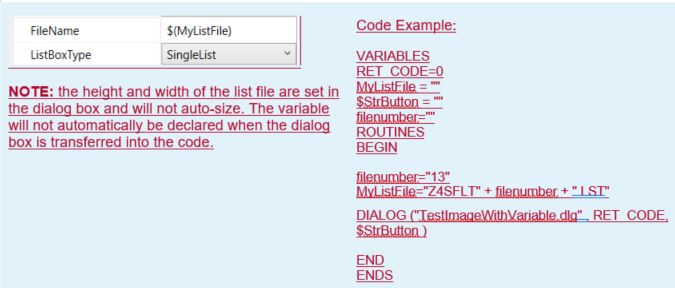
Dynamic FileNames can be created by using a variable for the FileName.
 View Dynamic FileName example

Note: The height and width of the list file are set in the dialog box and will not auto-size. The variable will not automatically be declared when the dialog box is transferred into the code.
Code example:
VARIABLES
RET_CODE=0
MyListFile = ""
$StrButton = ""
filenumber=""
ROUTINES
BEGIN
filenumber="13"
MyListFile="Z4SFLT" + filenumber + ".LST"
DIALOG ("TestImageWithVariable.dlg" , RET_CODE, $StrButton )
END
ENDS
-
If a default selection is preferred, input the SelectedItem field with the corresponding value from your list file.
-
Enter a VariableName to be used in your script code.
Must-enter, must-fill, and conditions can be used in conjunction with a ListBox control.
 View limitations
Criteria
Description
Must-fill
This field can be left blank, but if an entry is made, it must completely fill the input field.
Note: Must-fill can be used in conjunction with Must-enter so that an entry is required and it must completely fill the field.
Must-enter
This field cannot be left blank.
Notes:
- Must-enter cannot be selected when a condition is present.
- Must-enter can be used in conjunction with Must-fill so that an entry is required and it must completely fill the field.
Condition
- If the condition you establish is met, the cursor is allowed in the control and data can be entered.
- If the condition you establish is not met, the cursor is not allowed in the control and data cannot be entered.
Example: ((itin_i=="")AND(itin_ii==""))
If the value of the variable itin_i is null AND the value of the variable itin_ii is null, then data can be entered in the control.
Note: A condition cannot be used if Must-enter has been selected.
-
-
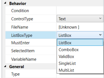
Select a ListBoxType in the Behavior section.

The following ListBoxTypes are available.
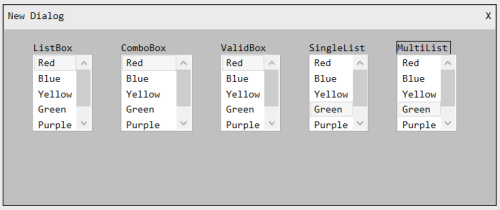
ListBox examples
The following example shows ListBoxes in the editor. Notice the height for each box is declared the same.

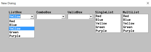
The following example shows the dialog box as it is seen while running. Notice how each box displays differently.
Note: Yellow was the default color on the ListBox; therefore, the drop-down is open and the color is selected.

List files
See List Files for information on creating files that contain lists associated with the above control types.